Drive Clicks and Conversions with Winning CTAs
All hail the CTA!
The little button can deliver huge results, but only if you invest a bit more time and bring more creativity to this critical item, which is often the last thing you write before finalizing your copy.
The call to action is the hook that every page needs to take a prospect where you want them to be. They’ve got to be bold, crisp, clear and relevant. They deserve all the attention you can spare.
CTAs are one of the keys to lead generation, to sales, to signups and many other actions. We must persuade digital buyers, seekers, wanderers and other visitors to eagerly click on that button or make that call right now. We’ve got to add some pizzazz and pop to the button without making it wordy and a nightmare to fit into design. We need conversions to achieve our goals.
CTAs take prospects where you want them to be – at an order form, a landing page, a white paper request – where you can make a sale, capture their contact information, satisfy their curiosity, or answer a question.
Here are a few tips for creating CTAs that generate a high click-through rate.
Suggest, Even Demand, An Action
A uses comes to your site looking to find something of value – information, a product, a service, maybe even a surprise. Make it clear in your CTA that if they take action, they will receive a benefit. Spell out what’s in it for them. Be specific.
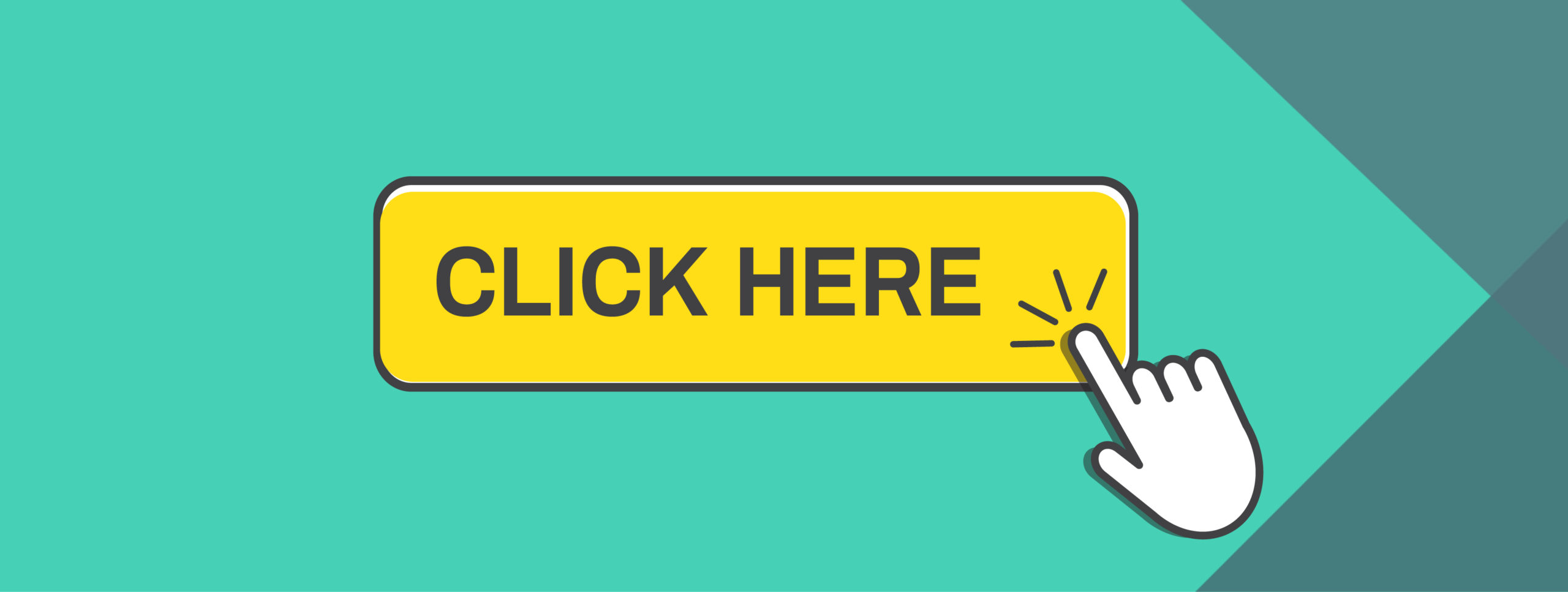
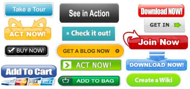
Don’t just say “Read More” or “Buy Now!” That’s a high-friction, low-payoff phrase. Without going on and on, tell them what awaits. “Download Brochure.” Lame. High-friction words imply more work, an assignment or obligation. Buy. Submit. Give. Invest. Donate. Not very exciting. These are much better, and they highlight the rewards that are in store for you:
• Send me the free book.
• Unlock the white paper.
• Order your tasty sample.
• Get a 25%-off coupon.
• Lock in my appointment.
• Show me the best course.
The benefits of all of these actions are clear. Even short CTAs can carry a benefit. “Register Now” is bland but “Join Us” makes you feel like you are wanted and you’ll feel good about taking the action. What a deal! Words like “reserve,” “discover,” “earn” and “receive” are low-friction words that make an action worth the effort.
When appropriate, create a sense of urgency in your CTA button. “25% Off Today Only!” or “Now’s The Time To Enroll!”
Design Consistency is Key
As you design your emails, social media posts, websites and landing pages, stay consistent. Make it easy for users to spot your CTAs and take action. Maintain a look and presentation style that helps visitors find exactly what they came to you for. Don’t get too clever in your overall design and end up underplaying it, and don’t tuck it under a graphic that overwhelms it. Big buttons aren’t always better. Don’t scrimp on the white space surrounding them. Dressing up a button with small icons or arrows may motivate users to act.
Consider consistency in color, font, size, shape and voice for all your CTAs. Make them readily visible with appropriately contrasting colors – but not distracting and out of character for the look and feel you’ve adopted for your brand. Some sites prefer to use first person “my.” Others get better results with “you.” See what works best for your audience.
Keep them short and to the point, but spell out the benefit. That can be a writer’s challenge. Good CTAs often play off a main headline that promises clear benefits. The article is headlined “Here Are 12 Can’t Miss Investment Ideas,” and the CTA grabs you with “Get Your Dynamic Dozen Here.”
Be sure to doublecheck how your CTA looks and works on all devices – desktop, laptop, tablet and phone. Wonky display and too many buttons on a page can trigger decision fatigue and be a click killer.
Build Support For Your CTA
Don’t leave your CTA hanging out there all alone. Give it some help. In the copy leading up to your CTA, explain the benefits that await visitors. Build the case for them to take action before you get to the button. Sell them on how they can maximize their career potential by signing up for this amazing, engaging and free webinar. Then they can’t resist the urge to click on the “Register and Change Your Life” button!
Location, Location, Location
Most CTAs appear at the bottom of your pitch, and for good reason. You’ve offered a compelling argument for action or a clear description of an awaiting benefit. Some effective CTAs are placed high in the message to capture the click from a user who has already made up their mind to take action. A CTA up high and one at the end of your message could be a winning combo.
Try To Do Better
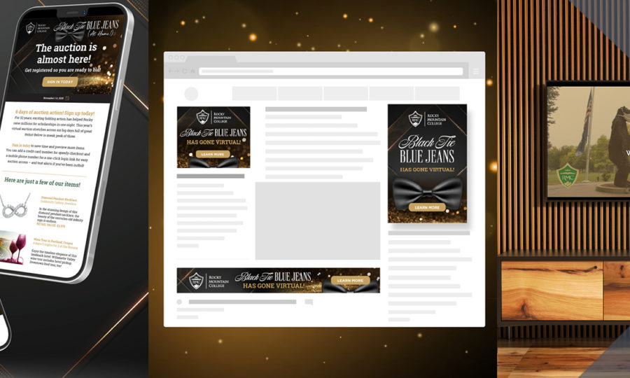
Don’t grow complacent with CTAs that seem to be performing just fine. Test some other verbiage. Try some other designs, colors and locations. See if your results can be improved. Some CTAs with a small image of the product, brochure, book or gift are quite effective.
Maximize the usability. Maximize the benefit. Minimize the friction. Then watch those conversions soar.