
Daily Logo Challenge Yields Winners, Losers, Lots of Lessons
Back in October, I decided to start the Daily Logo Challenge in my free time (excluding weekends and holidays) to grow as a designer. The Daily Logo Challenge is the creation of Harris Roberts, founder of DailyLogoChallenge.com.
The website essentially sends logo prompts to your email. Every day you will be sent a logo prompt. Each prompt comes with a few logo name ideas to help if you are drawing a blank. The email will also include an occasional tip or trick.
As an extra restriction for myself, I decided I would spend no more than 30 to 60 minutes on each logo. This allowed me to focus on just the ideas and not get into all the little details that make a logo really shine. Without that restriction, I could spend all day on a logo as nothing is ever perfect.
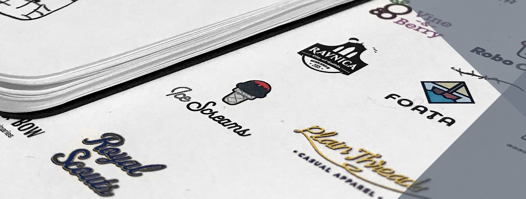
Below is a matrix of the end results of each logo. I would love to go over each prompt and each logo, but, honestly, that could fill a book. So for today, I’m just going to go over the top three successes, the top three failures, and what I learned from each.
![]()
Learning from failure is one of the strongest tools in your arsenal and should not be looked at negatively. Knowing what to do is important; knowing what not to do is equally as important. Also, I’d like to just quickly show some runner-ups that, had I had more time, could have developed into nice designs.
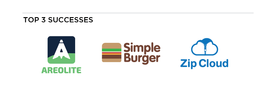
Aerolite: This logo was the first one I did, and, coincidentally, one of the best. Without even knowing the prompt, you understand that this logo has to do with space exploration. I also think it scales very well. By that I mean the logo works with multiple applications. It works well as an app icon. Without the background, it can be displayed in black and white. It is easy to see at a reduced size, and I can even see applications of it being used as a badge or embroidery (like those seen on Star Trek uniforms).
Simple Burger: I asked several other designers to pick their three favorites, and Simple Burger was always one of the picks. With this logo, I wanted to lean hard into minimalism, and frankly… I nailed it. The typeface is round and thick like any good burger patty should be, while also being friendly and inviting. It also translates into black and white well. Nothing else to say here – 9/10.
Zip Cloud: I picked this last one for similar reasons that I picked Aerolite. This logo screams cloud computing. Between the color, the obvious cloud shape and the zipper that is revealing space inside, this logo perfectly conveys that this is a digital cloud service without even knowing the name. You could probably even guess the name just by breaking down the logomark. With an extra hour of work, this would be a logo I’d be confident enough to present to companies like Google, Microsoft, etc.
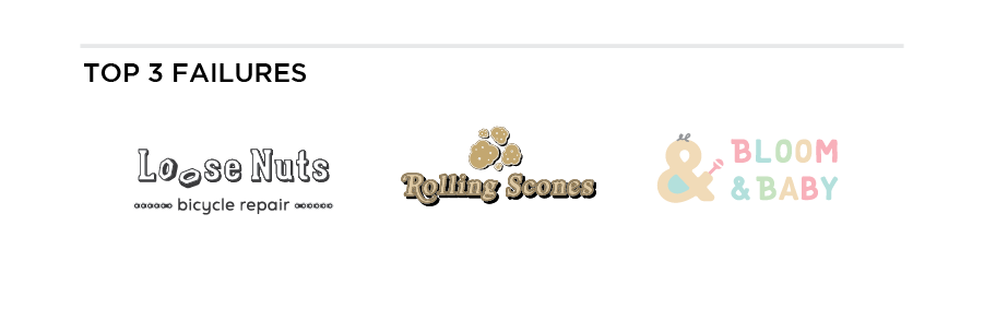
Loose Nuts: This logo has an OK idea behind it, but the execution was very sloppy. If I wanted to do this right, I would probably need to draw it by hand so I can get a more accurate perspective. I cheated and used a simple shadow for a faux 3D effect. Not something I wanted to do in 30 to 60 minutes.
Rolling Scones: This one is just terrible. Don’t try and recreate famous typographic logos in 30 minutes and expect it to be perfect. The color choices are bad, the logomark did not come out like the sketch looked, and I know there are better ways to show motion and certainly better ways to illustrate a scone. When I hit 40 minutes on this project, I decided to cut my losses and learn from my mistakes.
Bloom & Baby: I got too gimmicky with this one. The typeface is fine. It’s fun, friendly and childlike without falling into that “comic sans” trap of making it “fun” through unbalanced forms and wavy edges. Where this logo went wrong is the mark and the colors. The colors are way too pastel. It’s incredibly hard to read on white, and too bright when displayed on black. The logomark is way too forced. Having the ampersand be the baby seemed clever, but since it doesn’t read as a baby without the rattle and hair squiggle, it makes me question why use the ampersand at all? Not to mention, I feel it’s just confusing to see an ampersand as the logo and in the logo type. This logo would have been better if I just dropped the baby mark completely and just let the logo be type.
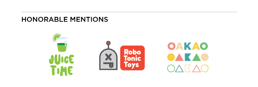
Juice Time: This logo works very well for a juice shop. Very much feels like the trendy smoothie shop you would probably find in the mall. It conveys the brand perfectly. However, I have a feeling that the typography would become dated in 10 years’ time. It also doesn’t work well in a single color like black.
Robo Tonic Toys: This logo hits all the marks of a hip, trendy brand. However it requires context. Without the word ‘toys’ in the logo type, would you know what this brand is for?
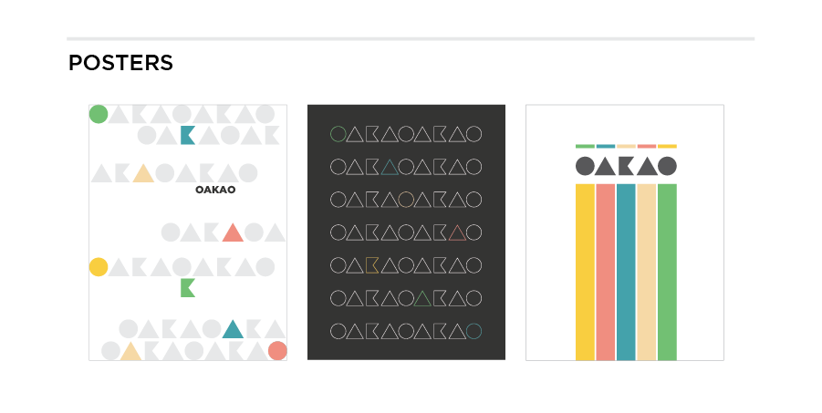
OAKAO: I really LOVED this logo. However. it seems like I couldn’t actually figure out what the actual logo was. I made a couple typographic posters with this logo, but it was still never clear. Is the logo the name or the shapes? It could have been good with a little bit more time to strategize how the graphics would be applied to the overall brand. Bonus posters below.
Overall, I’d really recommend this project for those looking to develop conceptual skills or sketching skills. While sketching was not a focus for me with this project, as I leaned in more towards concept, I think this would be great for your sketchbook. I may try another logo challenge next year and focus ONLY on sketching.
Need a logo of your own? You’re in good hands with Kinetic. Give us a call!