Innovate. Create. But then follow the rules!
Josh Wirth Creative Director
I know, I know. We are supposed to be the rule breakers, the creative rebels who know no boundaries and follow no convention.
But there are good rules to follow – the rules that we define. When developing your branding, there are so many things to consider. What is the tone and tenor we use when communicating to potential customers? Do we need a stacked version of our logo for that inevitable odd building sign that just doesn’t work? When we list our hours, do we say 8am or 8:00 a.m.?
You might be asking first, why does it matter? From the logo to the hours on the door, consistency is crucial. Consistency builds expectations, and when expectations are met, you build trust. Your audience is inundated with ads and logos all day every day (someone, somewhere is preparing for the future when we can advertise to people in their sleep). With all those logos and ads, it is important that you are consistent, so you can hopefully make an impression.
The Marketing Rule of 7 says that your audience needs to hear/see your message seven times before they will take action. If you don’t believe it, think back. I am guessing you will remember a time when after watching a commercial for the seventh time you said, “Oh… that was Geico commercial?!”
If your ad style or voice is changing every other ad, what hope do you have of getting recognized?
Mistakes will happen
Whether your company has three people or 3,000 people, the potential for your branding to go off the rails is very high.
- Carl in HR didn’t know that there was a PowerPoint template on the company intranet. (To be fair, Carl doesn’t follow the rules. He’s pretty checked out these days.) So now he is using six-point type and has 400 words on one slide with an amazing cat meme (“Hang in There”) that he pulled from the Internet.
- Your CEO has more important things to worry about than which logo does she send to your new partner. So she sends a JPG that she took off of a Google search.
- The intern needs to send an EPS file to the printer! (“Can I take that JPG the CEO sent me and put it in Illustrator? Does that work?”) Oh, and don’t worry, the interns aren’t reading this article. They are all in the break room on their phones posting on Insta, or Kik, or Flop. Ok, I made Flop up, but you thought it was real.
Try as we all might, we have other things to worry about in our daily working lives other than which logo, font or template we use.
Get to the point! What do we do?!
That is a loaded question. But let us give you a quick place to start. Develop a brand guide. A brand guide can get as granular as you like, but if you are just getting started make sure you cover the basics.
Logo Usage – The do’s: show all acceptable uses (color, black and white, one color, etc.) and the don’ts: don’t change colors, fonts, etc. Be sure to package and define all the various versions of the logo as well. For example, transparent PNGs for web, or an EPS version for your signage or vehicle graphics.![]()
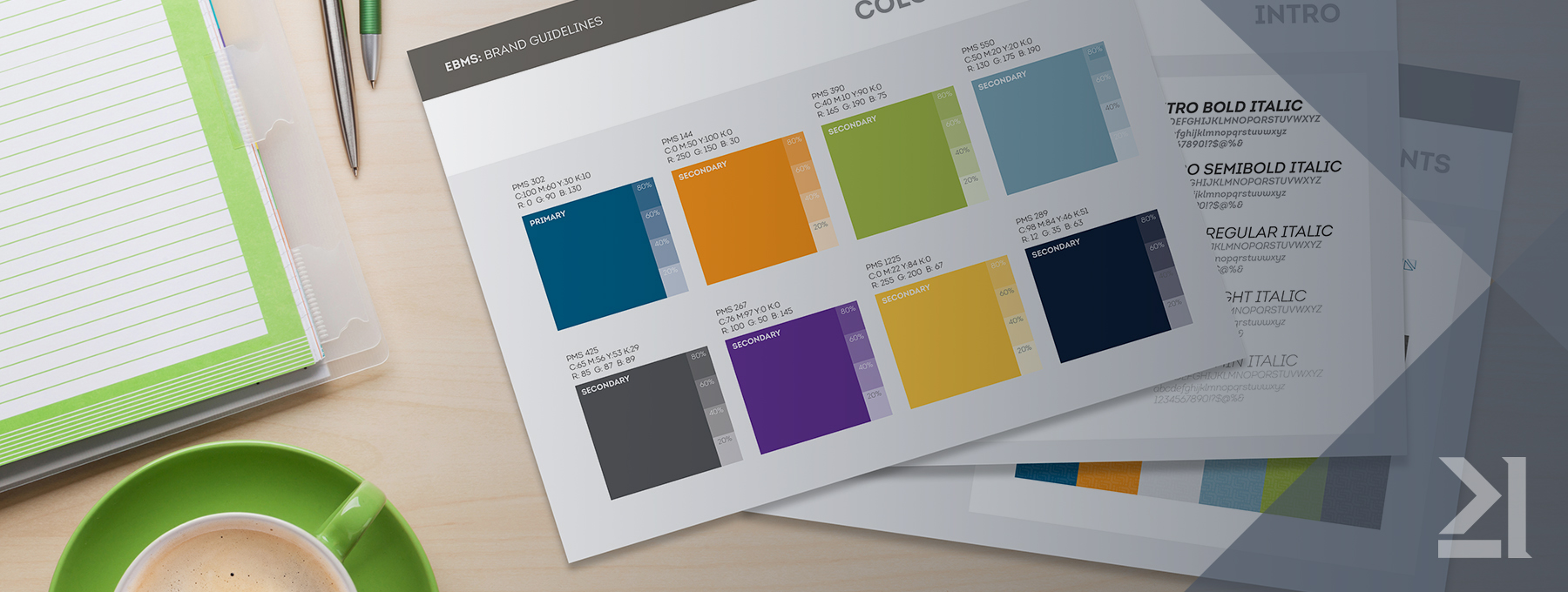
Color Palette – Color goes a long way for brand recognition, so pick your colors carefully. When choosing colors, be sure to select values that can be represented in print as well as assign pantone colors for when specialty applications need to be used.
Typography and Font Usage – If you are choosing a brand font, pick a family that is well developed. That cool new font you found may look great, but it’s possible that it wasn’t developed to include a lowercase ‘s’ (this has actually happened to me). You can also define styles for headlines, subheads, and body copy, the alignment, spacing, etc.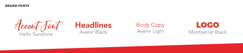
Image/Illustration/Texture/Icon Usage – Define a style that complements your brand and stick to it. Are you going to use black and white photography? Are you going to show images of your product in use or isolated on a white background?
If you need icons, are they thin with a sketched quality or are they more of a flat, vector style?
Develop a Tone and Tenor – How do you talk about your company? Your product? However you sound, be authentic. Show some examples of ad copy or social media posts.
Show examples – Now that you have defined all the pieces, make the puzzle. Letterheads, business cards, PowerPoint templates, ad styles – these all give your employees and vendors more context for how the branding is to be used.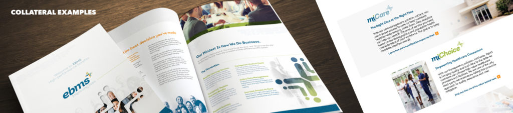
We did all that. What’s next?
Share it with the masses. If everyone in your company knows that there are rules, it’s one less thing they need to think about. Give it to your vendors, put it on your website, don’t be shy about sharing how your brand should be used.
Make someone own it. Without a brand owner to keep an eye on things, it is very easy to deviate. Someone scans an original, someone else changes it after that, and pretty soon that invoice that you spent time and money designing has turned in to a scan of a scan of a scan.
Don’t deviate. Not for a long time at least. There should always be some flexibility within your branding to modify but make sure that any changes are reflected in the brand guide.
Josh Wirth
Creative Director
Josh has been working on creative solutions since he was old enough to pick up a crayon. He’s a lover of all things creative. When Josh isn’t at the Kinetic office you can usually find him sketching on his iPad or hidden behind a camera (usually with his trusty dog in tow.)
During his time at Kinetic, Josh has executed multiple photo and video shoots, designed numerous brands and websites, and has been involved in award-winning creative.
Read more about Josh