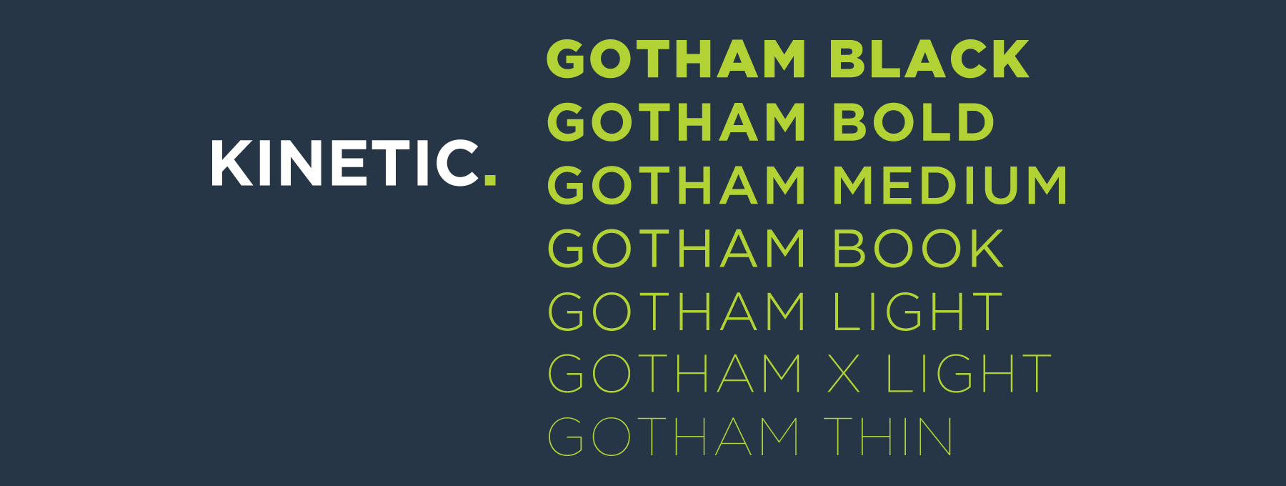
The Font of The Decade: GOTHAM
Design has many assets that can be drawn upon to visually communicate with users. While color, texture, photo styles and UX all have an important role, none communicate the feel of a brand more succinctly than the fonts chosen to represent it. And no font has had quite the 10-year ubiquitous run that the Gotham typeface family has enjoyed.
Gotham was conceived in the early 2000s, when GQ magazine hired New York City-based type foundry hired New York City-based type foundry Hoefler & Frere-Jones to create a new typeface for use in their publication. Given the instructions to create a geometric sans serif that felt “masculine, new, and fresh,” designer Tobias Frere-Jones drew influences from building signage seen around the city. Using seemingly plain, engineering-based lettering from New York’s Port Authority Bus Terminal as the design’s starting point, a typeface was born.
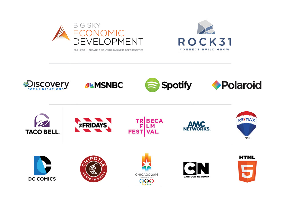
In 2002, GQ’s exclusive license expired and the font was released for public use. Spreading quickly, it has been featured in ad campaigns, corporate logos, advertising for brands like Taco Bell, DC Comics and Starbucks.
Due to its popularity and bold no-nonsense “American” feel, a Rounded variant was created in 2005. A few years later, Narrow, and Extra Narrow options were introduced.
At Kinetic, we always look to match the perfect fonts with our clients’ branding. That’s why we have been known to reach for what USA Today has declared the “font of the decade,” Gotham.
Real-world examples of Gotham font in Action:
What better way to exemplify the ethos of this typeface than to give some design and branding examples from a few of our partners at Kinetic Marketing & Creative. Here are three clients that typified (pun intended) the characteristics of the Gotham font at their core. 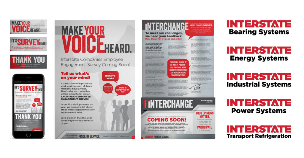
Interstate Power Systems
Interstate Power Systems is a leading distributor of on- and off-highway engines and transmissions, as well as parts and services for vocational trucks and heavy equipment. The no-nonsense aesthetic of Gotham was their perfect match.
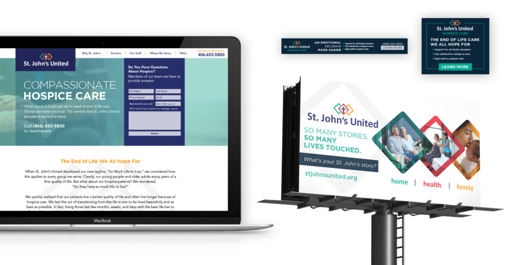
St. John’s United
St. John’s United is one of Montana’s most trusted providers of senior living and healthcare. They needed a font that didn’t beat around the bush, something that embodied their mission to provide high-quality care backed by trained nurses and state-of-the-art facilities. Gotham fit the bill. Its clear, no-frills style exudes stability and trust.
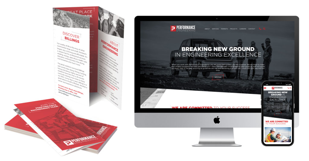
Performance Engineering
Performance Engineering is a company that combines civil engineering, land surveying, and the highest quality customer experience. They mean business when it comes to customer satisfaction. Gotham was the obvious choice for their body font and its geometric sans serif shape nods at the mathematical, mechanical, and masculine nature of Performance Engineering’s services.
How can Kinetic Help?
Kinetic Marketing and Creative is a marketing agency headquartered in Billings, Montana that provides award-winning full-service marketing and creative solutions for companies, institutions, and startups of all shapes and sizes. Tap into our team of marketing experts to move your company forward. Contact us today to start the conversation.
Editor’s note: This article was originally published on March 21, 2019 and has been updated for clarity.