

10 User Experience (UX) Tips to Design Your New Website
*UPDATED JAN. 07, 2020*
If you’re looking to revamp, redesign or start fresh with your website, we have a few tips to help you get started.
User Experience design can be broken down to three components: a website’s look, feel and usability. By optimizing your design in these three areas, you will reach your goal of providing the best user experience possible.
Here are our top 10 tips to achieve better Google rankings, serve more engaged users and produce an overall better-looking site!
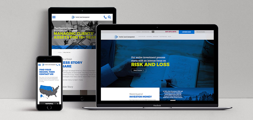
1) Design for Responsiveness
Mobile design is not just a factor to consider when designing a new site. You should design primarily for mobile because more viewers typically view your site on their mobile devices than their desktops. Users expect your website to look great across all devices and are much more likely to bounce if your site hasn’t been optimized for mobile. Also, worth considering is your Google ranking. Google has changed its algorithm to factor in the responsiveness of a website’s design when considering where a site ranks. It’s not just about keywords and SEO.
2) Focus on the User’s Experience
Designing your website for a memorable user experience is more important than what the site actually says. Users won’t often remember specific data points or verbiage from your site, but they will remember how it made them feel. Focusing on the user’s experience means making sure that the copy, photos, graphics, and interactive elements work together to create an experience for the user. Making your site stand out is important, but not at the cost of abandoning the user in favor of creating something too different and foreign.
3) Brand Consistency
This isn’t just about using your brand colors, fonts and photo style throughout your site, although that is very important. We’re going to assume you know that. This is about the story that your site is telling. Building a brand is essentially telling a story, and your site is a very, very large part of that story to most people coming across your brand. It is your job to make sure your website is telling the correct story, not unwittingly reinforcing the incorrect story.
4) Clear and Simple Usability
The users landing on your site make evaluations of your site in less than a second. If they’re confused and don’t know what action to take right from your home page, they may bounce after only being on your site for a couple of seconds. Clarity and simplicity are paramount to encouraging users to dig deeper into your site. You need to decide what action you want your users to take and make it readily apparent. Don’t hide it among four other buttons that look identical but are much less important. Provide a clear path with little resistance for your users. Always remember, less is more.
5) Users Don’t Read, They Scan
Most users come to your site looking for a specific piece of information or product. While you may not know exactly what that is for every user, you can make your site more easily scannable to help them more quickly find what they’re looking for. Use a clear hierarchy of H1s, H2s, body styles, etc., so your users can scan as they need to and then switch over to deeper reading when they find an area they want to learn more about. This will help keep them on your site and possibly prompt them to contact you for further information.
6) Create Clear, Concise CTAs
Imagine your first time shopping in a new store and you find something you would like to purchase. Upon inspection of the item, you can’t seem to find any sort of price tag or description. To make matters worse, there doesn’t seem to be anyone working who can help you, and the checkout area is deserted. That’s what your site is like without great Calls To Action (CTAs). Your CTAs should be concise but clear, providing the user an easy route to get where they want to be. Make it as easy as possible for them to “Login,” “Signup,” or “Buy Now.” Those are users that want to be involved with you!
7) Use Ample White Space
White space gives all the elements on your site room to breathe visually. Don’t be afraid to err on the side of feeling like you’re providing too much space between elements. Doing so will allow the user to more easily determine the visual hierarchy and quickly find what is most important to them. If you try to cram too many elements into too small of a space, your users will become frustrated and leave your site.
8) Use High Quality, High-Resolution Photos
Not much can take a great site design down and make a user want to bounce quicker than poor photography. Good photography and graphics are worth investing in. In this helpful article, we wrote in detail about it. Check it out. Don’t forget to compress your photos and graphics for web once you have them. It will help your site load quicker and your users will have a better experience without waiting for a page to load!
9) Reuse Common Design Elements
Your entire site design should be able to be condensed down to a handful of design elements, possibly with a few additional slight variations of those. Why? Users will understand your site and move through it more easily when they aren’t trying to figure out the hierarchy and way to use each new section. This also ties back into Tip No. 3 – it keeps your branding cohesive and the user knows what to expect when they click over to a new page within your site. This isn’t to say your site should lack creativity, just that it should balance usability with the creativity with the user in mind.
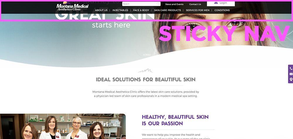
10) Easy-to-Use Navigation
A site’s navigation can be a point of major frustration for users. On the flip side, it can also provide a clear, frictionless direction for your user. A great way to know if the UX design of your site has been done properly is if your users can use the navigation intuitively without searching. We have several methods to help ensure your users don’t become frustrated and bounce. The first method that we almost always use is “sticky” navigation. This means the navigation bar is always available at the top no matter where on a page a user might be. Additionally, you’ll want to include page headers (this also helps with SEO) and breadcrumb navigation. These help your users always know where they have ended up on your site.
11) Bonus Tip
Provide the users of your website more than what they expect to find and make it as easy as possible for them to purchase from you. Make things abundantly clear to them what you sell, why you sell it, why they should want to buy from you, etc. If they aren’t able to purchase directly from your site, give them step-by-step instructions of what they need to do to complete a purchase from you. It may just make the difference between them deciding to buy from you instead of your competitor.