Case Study: Intuitive App Development
When third-party healthcare insurance administration leader EBMS needed an app refresh, they turned to Kinetic. We kicked off the project with a thorough user-experience workshop to learn how the app was being used by a diverse range of EBMS stakeholders. This research yielded valuable insight that informed the design and development of a new app that was accessible, intuitive and easily navigable.
Opportunity
EBMS, an industry leader in third-party healthcare insurance administration of self-funded plans, engaged Kinetic Marketing & Creative to assist in a comprehensive application refresh and design. Based on the diverse nature of users for whom this application would need to be accessible, intuitive and easily navigable, Kinetic facilitated an in-depth, user-experience workshop at the outset of this effort.
Actions
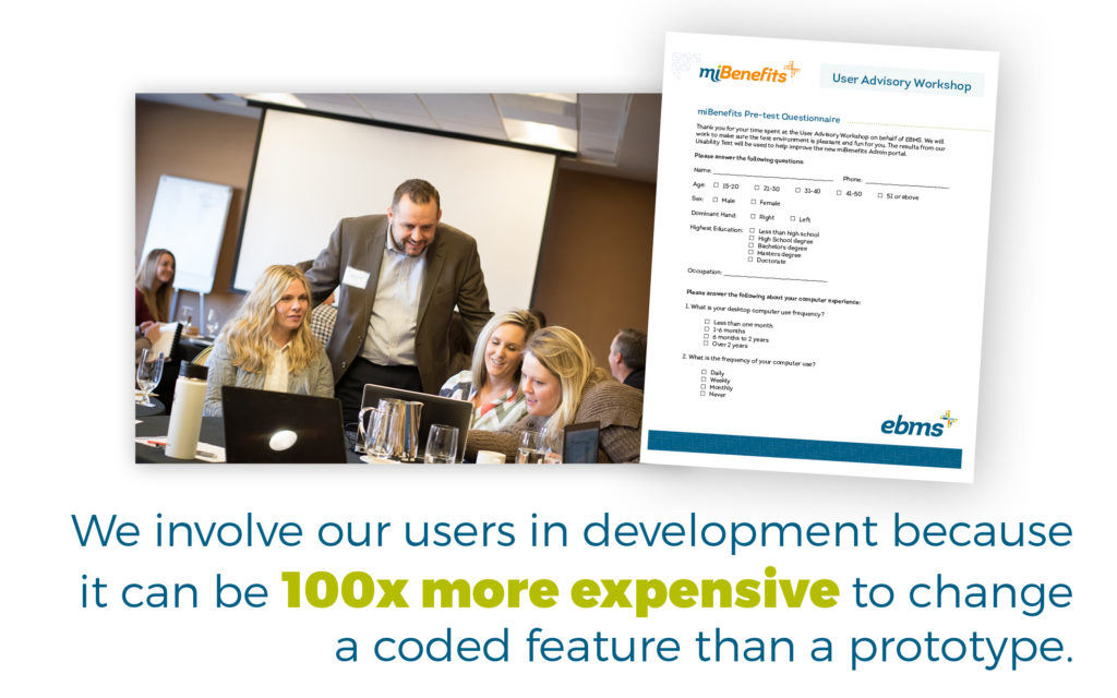
The first critical step in creating an effective user-centered application is conducting in-person UX workshops. For EBMS, this workshop was designed to bring together perspectives from across the spectrum of demographic profiles, professions and tech-experience levels of current and potential users (ranging from HR directors, independent brokers and individual policy holders).

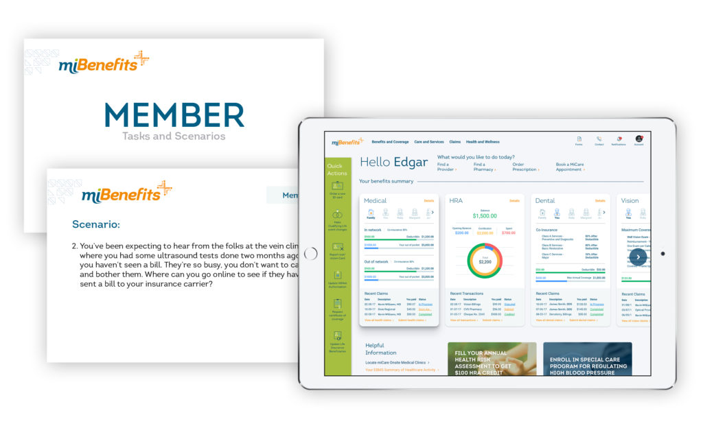
During the work session, the users were observed as they navigated the many features of the application. Specific tasks were assigned, and the results were closely tracked and recorded. We then provided our development team with in-depth data to translate into actionable solutions in the design and functionality of the application. Additionally, on-going conversations regarding the overall user experience assisted our team of web and creative designers, as well EBMS leadership, to empathize with their users on a much deeper level — and led to additional invaluable insights.
Results
Every aspect of the EBMS application was planned, programmed and designed with the insights gained by this research-based and field-tested data. Navigability and ease of information retrieval were greatly improved. Usefulness of content, simplification of format to more easily absorb sections, and application access and functionality were also up-leveled.

Kinetic utilized the user testing results to inform design and development, leading to a much-improved user experience for current and new app users. Download a PDF of our digital interface user testing case study here.


